- Data Continuum
- Posts
- 2 Techniques to make your data points stand out...
2 Techniques to make your data points stand out...
What differentiates the lead character from all other characters is the spotlight...
Sasi SB
July 16, 2024
A play consists of a lot of actors.
But there is always one person in the spotlight.
No matter how well others act, your focus tends to remain on the person in the spotlight.
Why is that?
Because the spotlight gives that person value over others. It tells you that this particular person is the key figure among the rest.
It also conveys to the audience that the person in the spotlight is the key character.
Highlighting values in reports is like putting a spotlight on key actors in a play, ensuring the audience's attention is drawn to the most important parts of the performance.
In Power BI, there are several techniques to make these key data points stand out:
Conditional formatting
Overlaid analytics
Anomaly detection
Specialized visuals
All of these are discussed in detail in my Power BI Design Mastery which I have written for you.
However, in this email, we’re gonna keep our focus on the first two techniques…
Conditional Formatting
This technique is like giving specific characters in a play distinctive costumes or lighting to make them stand out. You can use conditional formatting to highlight specific cells in the table and matrix visuals using:
Background color
Font color
Data bars
Icons
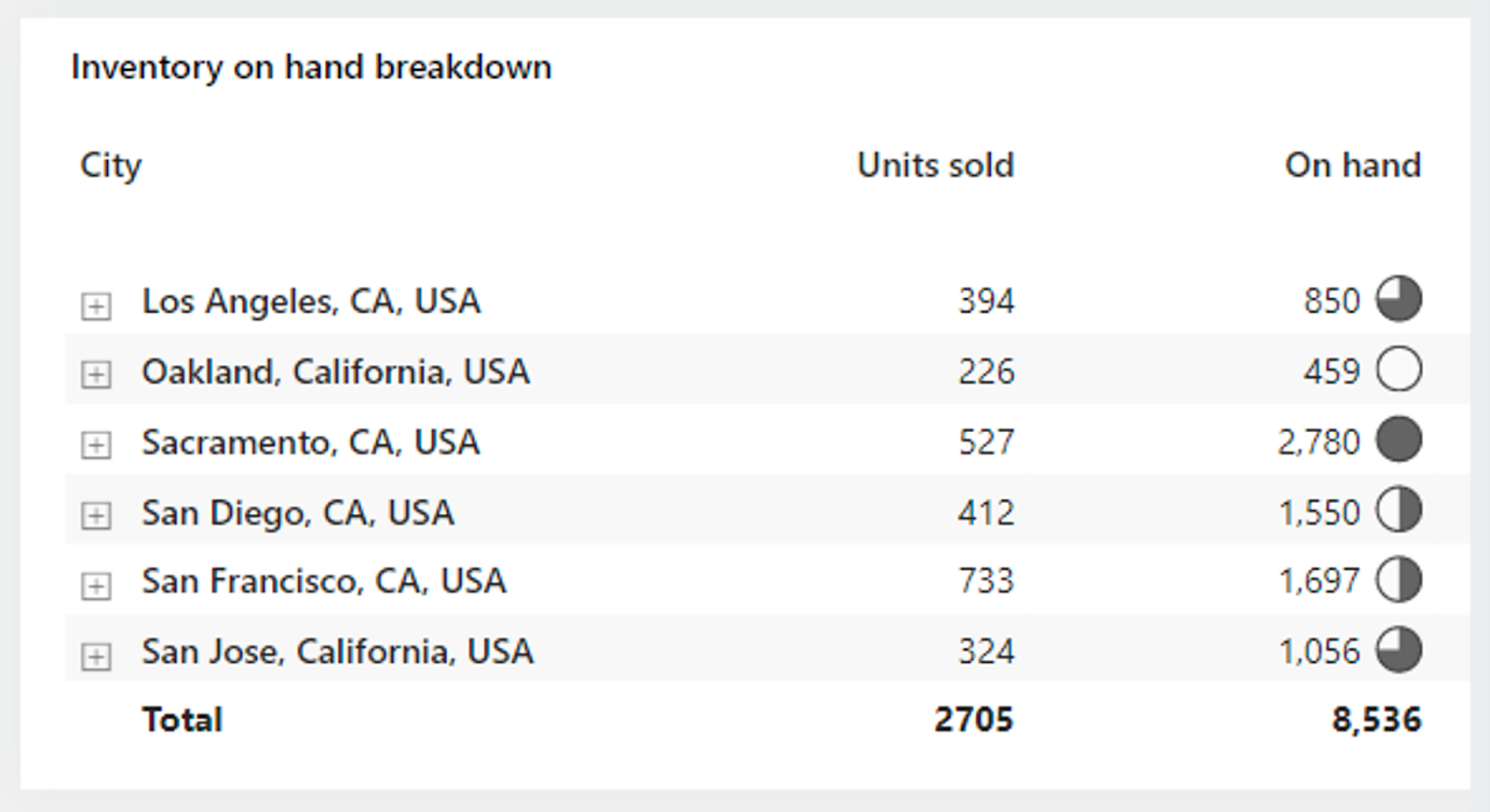
The image below shows a matrix visual with icons, highlighting the On-hand values, much like how a spotlight might highlight the lead actor on stage.
Overlaid Analytics
Overlaying analytics is akin to adding annotations or special effects to a play, enhancing key moments and making them more noticeable.
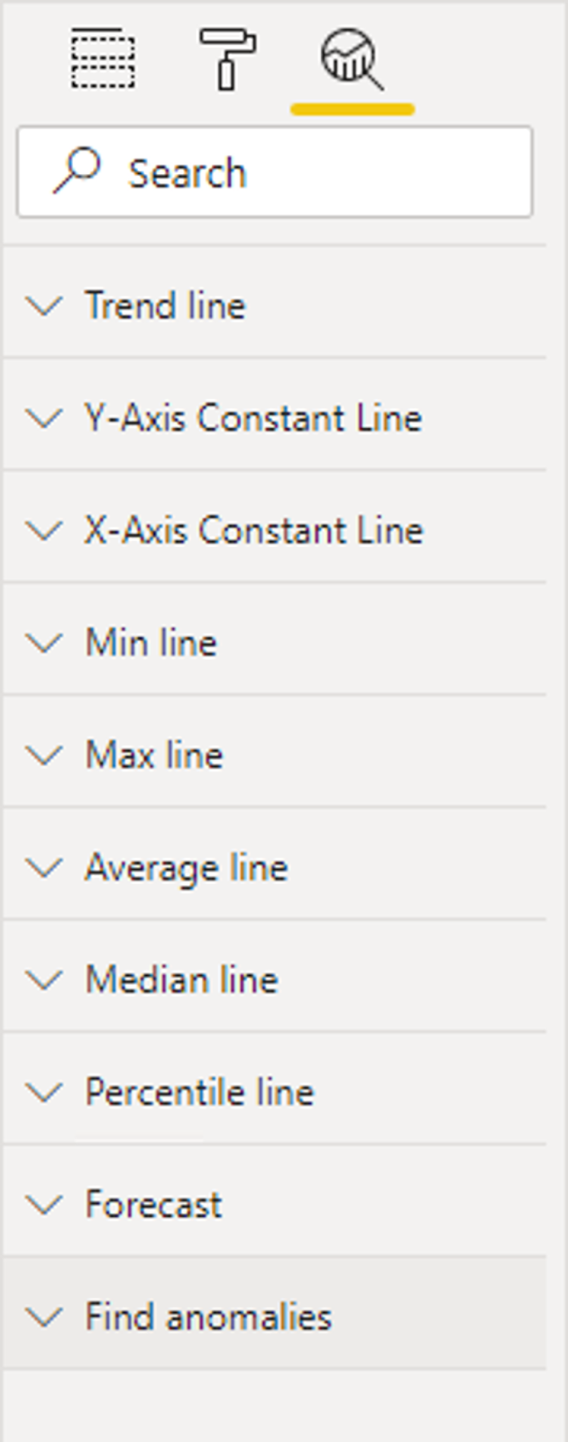
Certain visuals, like line charts, allow you to add analytic options such as:
Trend lines
Constant lines
Minimum or maximum lines
And many others
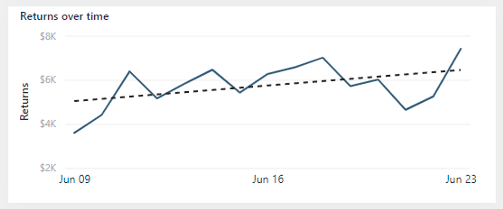
The following image is an example of a trend line. The upward gradient of the trend line indicates that returns are increasing over time, just as a spotlight might highlight the climax of a performance.
By using these techniques, you ensure that the critical parts of your data get the attention they deserve, making your reports more effective and easier to understand.
-Sasi
P.S.- The Power BI Design Mastery will be launched this Friday, July 19th.
Those who buy it within the first 72 hours of the launch will get it for only $30.
After that, prices will increase.
Don’t miss out on this.
Reply